📊 Dashboards & Metrics
Dashboards in PlanGuru Analytics provide real-time performance snapshots of your financial data. Instead of digging through spreadsheets, dashboards bring your most important numbers into one visual, easy-to-understand view.
They transform rows of data into charts, KPIs, and summaries that decision-makers can absorb in seconds, making financial conversations clearer and faster.
![]()
1️⃣ Why Dashboards Matter
Dashboards help you:
-
View real-time financial performance
-
Compare Actual vs Budget vs Forecast
-
Monitor Cash Flow, Profitability, Liquidity, and Efficiency
-
Simplify executive-level reporting
-
Replace static Excel reports with dynamic visuals
Think of dashboards as your financial command center.
2️⃣ Default Dashboards
When you open a company, several default dashboards are already available. These may include:
-
Historical year-to-date performance
-
Budget vs Actual comparisons
-
Forecast dashboards
-
Cash flow projections
-
Detailed financial statement summaries
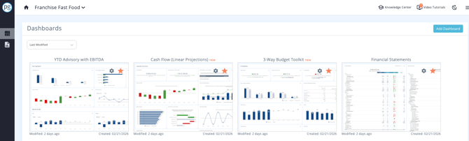
These provide a strong starting point for most users.
3️⃣ Dashboard Template Library
PlanGuru Analytics also includes a large library of dashboard templates.
Each template:
-
Includes a short description
-
Lists included KPIs
-
Shows purpose via hover tooltips
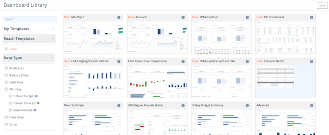
This makes it easy to get a head start building dashboards tailored to your needs.
4️⃣ Understanding Metrics
When you open a dashboard (for example, the Three-Way Budget Toolkit), you’ll see multiple rectangular elements.
These are called Metrics.
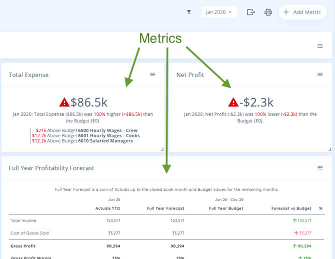
Types of Metrics:
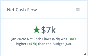
🔹 Live Text
Automatically updates as PlanGuru data updates.
Great for:
-
Budget vs Actual comparisons
-
Variance summaries
-
Key KPI highlights
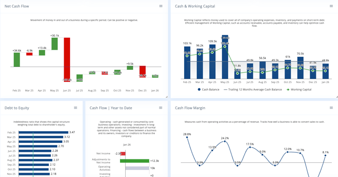
🔹 Charts
Visual representations of financial data.
Examples:
-
Column charts
-
Line charts
-
Bar charts
-
Pie charts
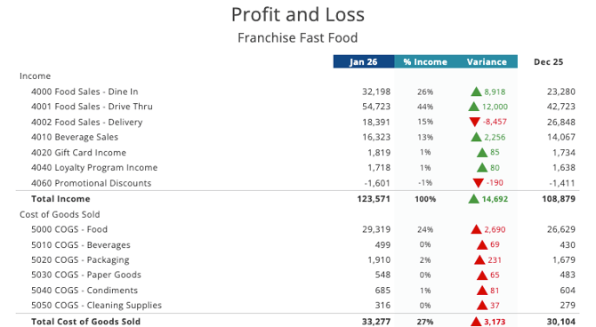
🔹 Tables
Custom table views that display:
-
Specific accounts
-
Assumption lines
-
Custom groupings
Perfect for:
-
Executive summaries
-
Detailed breakdowns
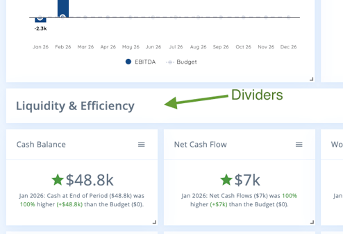
🔹 Dividers
Dividers act as section headers within dashboards.
Examples:
-
Profitability
-
Liquidity
-
Efficiency
5️⃣ Customizing Metrics
All metrics are fully customizable.
You can:
-
Reorder
-
Resize
-
Edit content
-
Change formatting
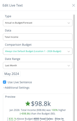
✏️ Editing Live Text
-
Click Edit on the Live Text metric.
-
Update the wording (e.g., change “Gross Profit” to “Total Income”).
-
Click Save.
The metric updates instantly.
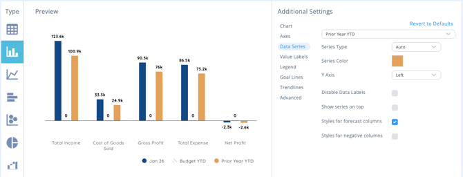
📈 Editing Charts
-
Click Edit on a chart.
-
A new configuration tab opens.
-
Adjust:
-
Dataset
-
Filters
-
Rows/Columns
-
Custom calculations
-
Below the dataset, choose how to visualize the data:
-
Column
-
Line
-
Bar
-
Pie and more
On the right side, adjust:
-
Headers
-
Labels
-
Colors
-
Display settings
6️⃣ Saving Metrics as Templates
If you create a metric you love:
-
Click the Save as Template option on the metric.
-
Store it in your personal template library.
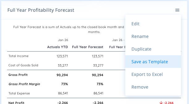
This is especially powerful for:
-
Business advisors managing multiple clients
-
Standardizing KPI dashboards
-
Reusing executive summary formats
7️⃣ Adding New Metrics
To add a new metric:
-
Click Add Metric
-
Choose from:
-
Built-in PlanGuru/Reach template library
-
Your saved templates
-
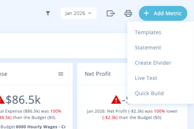
You can build highly customized dashboards combining:
-
Standard financial KPIs
-
Custom operational metrics
-
Client-specific performance measure