A more simple user navigation experience
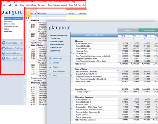
All of the navigation has been re-organized to all fit in a more intuitive format on the left and top of the analysis. We've taken away all the hard to find dropdowns, so you can get to where you want more efficiently.
New tab structure for Actual, Budget, and Forecast
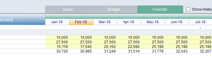
There are now tabs above the analysis sheet that allow you to quickly select what part of the analysis you would like to view. With the time periods also being color coded you can easily see what is historical/actual data and what is the forecasted numbers.
A cleaner, easier to read Analysis sheet
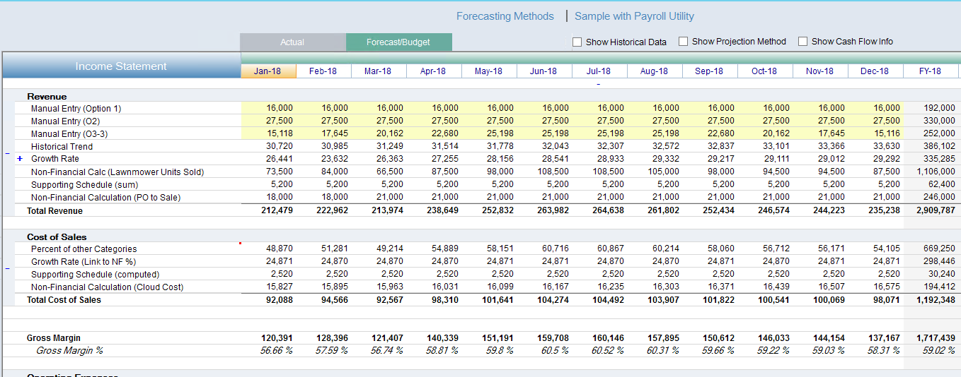
We've redesigned the analysis worksheet to be easier to read with less clutter. We increased the spacing between lines, added total lines and grey backgrounds to your category titles to help compartmentalize each section your working on. Full Year totals are also greyed out so that you can easily delineate between months and full years.
New Sample Companies included
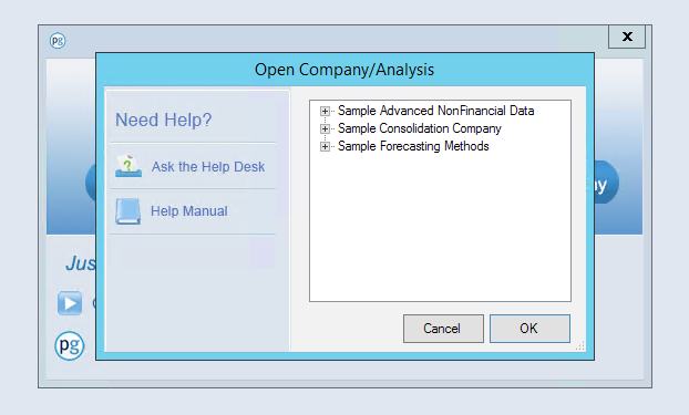
We are now including 3 new sample companies, which provide users access to examples of how PlanGuru can be set up in various scenarios of different sized businesses.
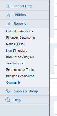
All your Reporting options in one place
Click here to install the update at https://www.planguru.com/support/downloads/